This article is about creating a plot of complexity over change rate for a given set of source code files. According to an idea I’ve seen on twitter last week, this might help us finding spots in the code that have an influence on how well a project goes. Here I’d like to show you a quick demonstration of that idea.
This is the original twitter post by Ian Partridge:
Fascinating idea from Michael Feathers: plot each file in your project on an X/Y graph: how often it’s changed (git) vs how complex it is (static analysis). Focus on the files in the top right corner of the graph - those are the ones holding your project back #iOSCon
To show how such a graph might look like, I’ve prepared a tiny demo project and applied that idea to it. In the following plot you can see the result.
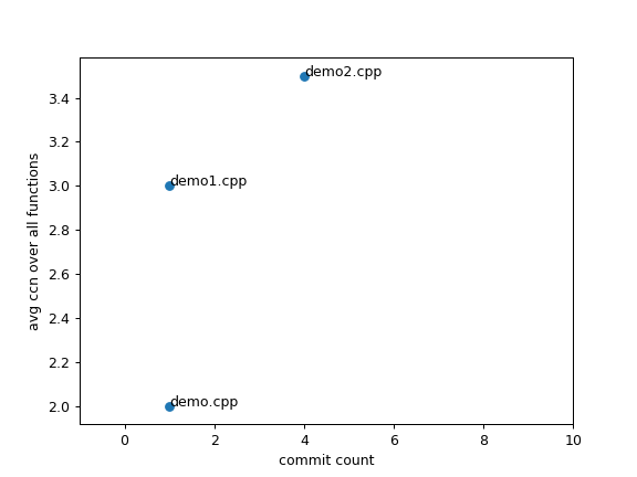
The horizontal axis in the diagram shows the total number of git commits for each file. On the vertical axis, the Cyclomatic Complexity of each file is plotted as a measure of code complexity.
We can see from this diagram that there are three source files in the project, all of which are probably not very complex with a maximum Cyclomatic Complexity of about 3.5. Still, for future refactoring plans the file demo2.cpp might be of particular interest. It has the most changes and is also the most complex one. This one is probably the hardest to maintain.
After this small demo let’s take a look at something bigger: the GNU coreutils. The following diagram shows complexity over changes for the sources of that project.
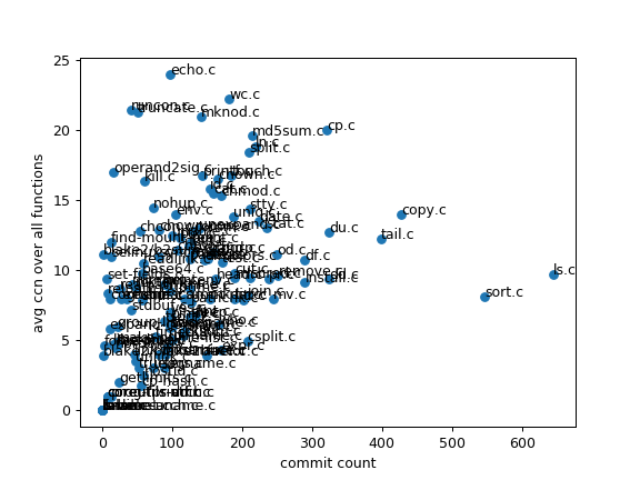
What’s in the top-right corner of the graph? It’s cp.c and copy.c. If the two metrics – CCN and git commit count – are valid, these are candidates for files holding the coreutils project back.
For a counterexample, let’s consider true.c – from the following zoomed-in version of the previous graph. It has medium complexity and only about 50 commits. What else would we expect from a program that does nothing than returning zero? Probably this one is pretty easy to maintain.
Closing & Conclusion
To gather data for those plots, git and lizard have been utilized from within some Python scripts. If you wish to create such diagrams yourself, feel free to get the example project from github!
That’s it so far. Some questions remain:
- Is Cyclomatic Complexity the right metric for the job?
- Isn’t the total number of commits a bit too coarse?